Toward the end of February, Google announced that they plan to place increasing importance on a site’s mobile-friendliness in search results for mobile devices starting April 21st. This is great news for HubPages because Hubs are already optimized for mobile. Mobile traffic is currently on the rise and with the release of this algorithm, we expect to see it increase even more dramatically.
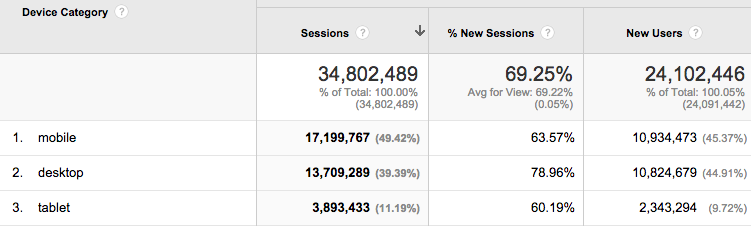
As you can see from this month’s data, mobile traffic to Hubs already exceeds desktop traffic. With the release of the new mobile algorithm, we expect mobile traffic to comprise at least 60% of our total traffic (and possibly as much as 70%) by the end of 2015.
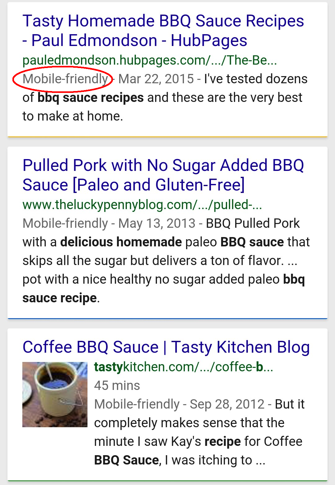
The new Mobile Friendly label in mobile search results:
What this means for Hubbers:
A high percentage of the people reading your Hubs will be doing so on smartphones. It is more important than ever to double check the layout of your Hubs to make sure they look good on mobile. We recommend making all capsules full-width wherever possible because while all capsules are automatically displayed full-width on mobile, the capsules may not display in the order you intended. Making them full-width means your capsules will always display exactly the way you want them to and offer a consistent experience for mobile and desktop users.
We understand that there may be reasons why you are unable to make all capsules full-width. For example, if your Hub includes photos that become blurry or pixelated when expanded to full-width size, it’s better to leave them half-width until you can replace them with better quality photos. However, it’s important that you check the Mobile Preview option for each Hub that contains half-width capsules to make sure the capsules will appear in the right order on smartphones.
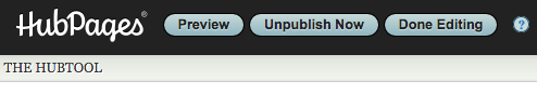
To see the Mobile Preview of a Hub, simply edit that Hub and choose the “Preview” option at the top of the HubTool:
Then make sure the Mobile Preview tab is selected:
 This preview shows your Hub exactly as it will look to users on smartphones. Take a quick look at the entire Hub to be sure half-width capsules appear in the correct order. If they do not, you may have to tweak your Hub’s layout to ensure that all the capsules display correctly on mobile.
I know this is potentially a lot of work for Hubbers with tens and hundreds of Hubs, but more and more people are using search engines from their mobile devices, and it’s critical that we as online writers prepare our content for the search traffic of the future.
 HubPages Blog
Thanks, I wasn’t sure how to check to see if my hubs were mobile friendly, now I can check to make sure they are.
If there’s no viable option but to use full-width photos can an option to “glue” photos to a block of text be introduced?
The reason I use the side-by-side option on many hubs is because using full-width photos puts ads and sizable gaps between the photos and the text I intend to use them to illustrate. It makes the presentation look terrible to have one of those trashy belly fat ads between a photo and the text it is intended to illustrate or enhance. It really makes tutorial instructions confusing, too.
Hi Kylyssa,
Thank you for the suggestion. An option like that would be non-trivial, engineering-wise, and we don’t really have the resources to implement something like that currently. In the future, we do intend to do more with the capsules to make mobile-friendly Hubs easier, but it’s not something we have a set time frame for yet.
Squidoo had something called a text module that had that function. Most content farms have something similar. It increases the visual appeal of articles.
When you read a magazine or newspaper online, notice how the ads don’t separate the text from the images illustrating it, especially not with unrelated advertisements? The current mode of ad insertion on HubPages is a dead giveaway to readers that they’ve found a post on a content farm rather than an article in a magazine. It seems like readers would be more likely to share pages that look like articles in online magazines rather than articles that look like posts from a content farm.
Personally- I love it! There is sure to be a rush to make old websites mobile friendly-and the result will be a better more fuctionally similar internet browsing experience. The people who just built websites should have purchased the insurance that protects for future tech changes;)
I love browsing HubPages using my smartphones while traveling by bus or jeepney here in the Philippines. Kodus to HubPages staff for bringing HubPages closer to us. 🙂
I didn’t noticed any changes in the search results on site not mobile friendly maybe 1 or 2 spots differnce
Just found your great article, thank you so much. Sometimes I feel like I am working for google – without the pay.
It is taking away a little bit of my creativity. Often, instead of thinking “What do my readers need” I am thinking “Will google like this”.