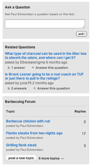
We are in the process of implementing an update that will remove the questions and forums boxes from Hubs to give them a cleaner, less cluttered interface. The Q&A and Forums sections of the site will, of course, remain unchanged.
One of the most interesting things about design is that the elements that are left out are just as important as the elements left in. A great example of this concept is demonstrated through the ma seen in traditional Japanese aesthetics- which is very present in some of the best design around- Apple products, for example.
For this reason, the HubPages team has been very careful to keep the site as streamlined as possible- removing any elements that are more distracting than functional. After analyzing some of the features that show up on the right-side of Hubs, we found that several of them were not being used by a vast majority of visitors. So we are removing the questions and forum boxes from Hubs to provide a more engaging and enjoyable experience for visitors to your Hubs. If the Hub is an Answer to a Question, then other Hubs answering the Question will still be listed.
The updated Hub layout rolls out today. We hope you like it!

Yes!
Well done. It is reflective of an observation I have been yelling about obnoxiously for over a year.
Cheers to a cleaner interface!
I think this will be a good thing.
I think this will be a good change. Thanks HP.
It does look a lot tidier without the boxes! Have they been removed to make way for more advertising space ? ;-P
Hi agvulpes – Thanks! No, we are not adding any more ads at the moment.
It’s definitely cleaner! Thanks HP! 😀
Very good move.
When focus is vital, less is invariably more. (Sounds like the start of a Haiku, doesn’t it?)
Anyway, well done HP, and thanks!
Love the new, improved look – much cleaner – go HP!
Good deal! I think that will help us all out.
Thank you.
I agree with @writeronline:
… Less is More.
Nice little update.
This is very welcoming
While I’m here, Does anyone know why I don’t have any capsules when I start a new hub.
I am pleased to see the change. It seems the old way was cluttered and confuseing.
My hats off 2 the change !! GREAT IDEA
Awesome.
One thing that I didn’t like about HP was the layout. It just felt too cluttered and distracting.
I’m happy to see this improvement!